Figures and tables
Examples write to examples/outputs/<name>/: *.png figures, *.gif animations,
*.json metrics at full precision, and *.tex tables of the same numbers
formatted for a paper.
xwm.plots.save_table(out / "results", headers, rows, caption=..., label=...)
xwm.plots.save_metrics(out / "metrics", {"probe_r2": 0.295})
xwm.plots.save_gif(out / "rollout.gif", [real, imagined], labels=["real", "imagined"])
xwm.plots.save_figure(ax.figure, out / "curve.png")
Rounding is a display concern, so the .tex rounds and the .json does not.
Every example writes both, from the same numbers: the table is for reading, the
JSON is for comparing runs.
Palettes, and their measured limits
Two named palettes, chosen by what the chart is doing:
| palette | for | colours |
|---|---|---|
"blue-orange" (CURVE_PALETTE) |
curves: losses, histories, error-vs-horizon | Wong's colourblind-safe blue, orange, sky blue, vermillion |
"viridis" (MAGNITUDE_PALETTE) |
magnitude: images, PCA colourbars, many-way bars | perceptually uniform |
Line charts usually carry two to four series and need maximum separation between them; the Wong family delivers adjacent-pair ΔE of 24–36 in OKLab, passing every check in both light and dark mode. A continuous quantity wants a perceptually uniform ramp instead.
Using viridis for categorical series means sampling discrete steps from a sequential ramp. That works, but only up to a point, and the point is measurable rather than a matter of taste:
| slots | CVD separation ΔE | normal-vision ΔE |
|---|---|---|
| 2 | 62.8 | 63.7 |
| 3 | 28.3 | 33.0 |
| 4 | 18.6 | 22.4 |
| 5 | 13.6 | 16.3 |
| 6 | 10.4 | 13.2, too low |
A normal-vision ΔE below 15 means readers with full colour vision cannot reliably
tell the pair apart, and no amount of secondary encoding fixes that. So
viridis_colors refuses more
than MAX_CATEGORICAL = 5 series and tells you to use small multiples instead. It
is a limit that is much more useful enforced than documented.
xwm.plots.viridis_colors(6)
# ValueError: 6 categorical series exceeds the 5 that viridis can separate ...
Two further consequences of using a sequential ramp categorically, both handled:
- Its ends are very dark and very light, so the extreme steps have low contrast against the plot surface. Every figure therefore carries a legend, and every example also writes the same numbers as a table, so nothing depends on reading a colour.
- Its middle is desaturated and reads grey-ish. Series get distinct markers and line styles as well as colours, so identity never rests on hue alone.
Style
with xwm.plots.plot_style(n_series=4, palette="blue-orange"):
    fig, ax = plt.subplots()
    ...

xwm.plots.save_figure(fig, out / "curve.png")
plot_style is a context manager over
matplotlib's rcParams; series_style(i, n)
returns the colour, marker and linestyle for series i if you are drawing by hand.
Ready-made plots
| function | draws |
|---|---|
plot_history |
training curves from Trainer.fit's history |
plot_horizon |
error against rollout horizon, with a baseline |
plot_spectrum / plot_spectra |
singular values of an embedding matrix |
plot_latent_pca |
latents in 2-D, coloured by a ground-truth quantity |
plot_mask |
a context/target split over the token grid |
plot_rollout |
real against imagined frames |
plot_frames |
a strip of frames |
plot_bars |
a categorical comparison |
fig, ax = plt.subplots()
xwm.plots.plot_history(history, keys=["loss", "embed_std"], ax=ax, logy=True)
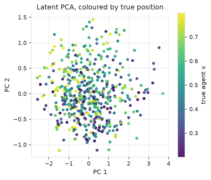
plot_latent_pca: embeddings in two dimensions, coloured by the
ground-truth quantity a probe would try to recover.
Tables
paths = xwm.plots.save_table(
    out / "results",
    ["policy", "mean (m)", "% of gap closed"],
    rows,
    caption="Franka tool distance to a goal image after 5 steps.",
    label="tab:franka-planning",
    float_format="{:.4f}",
)
# {'json': .../results.json, 'tex': .../results.tex}
One call writes both formats from one set of rows, so the LaTeX in a paper and the
JSON a script compares can never disagree: the .tex rounds to float_format,
the .json keeps full precision.
table_to_dict reads one back;
latex_table and
markdown_table render to a
string without writing, which is how the tables in these docs were produced.
Animations
xwm.plots.save_gif(
    out / "rollout.gif", [real, imagined],
    labels=["real", "imagined"], fps=8, scale=3,
)
Frames are (T, 3, H, W) floats or uint8; a list of stacks is tiled side by side
with labels. frames_to_uint8,
tile_frames and
upscale are the pieces, if you want to
assemble something else.
Matplotlib is optional
xwm.plots imports matplotlib lazily, so the core library installs and trains
without it. The functions that need it raise a clear error rather than failing at
import time, which is why plots is an extra and not a dependency.